A Lookahead with Marina Pavlova Design
Each fall, the design world waits eagerly for Pantone’s Colour of the Year—a forecast that influences everything from fashion to interiors worldwide. Pantone’s selection often sets the emotional tone for the year ahead, helping us understand how colour reflects the cultural moment. Their final verdict is expected this December, and it will undoubtedly complete the palette of inspiration shaping 2026.
In the meantime, several leading paint brands have already revealed their standout shades for 2026. These colours beautifully capture the themes of renewal, grounded optimism, and a return to organic comfort that continue to resonate in our homes. Let’s explore what’s trending and how to use each hue to refresh your space with confidence and personality.
Benjamin Moore – Silhouette (AF-655)
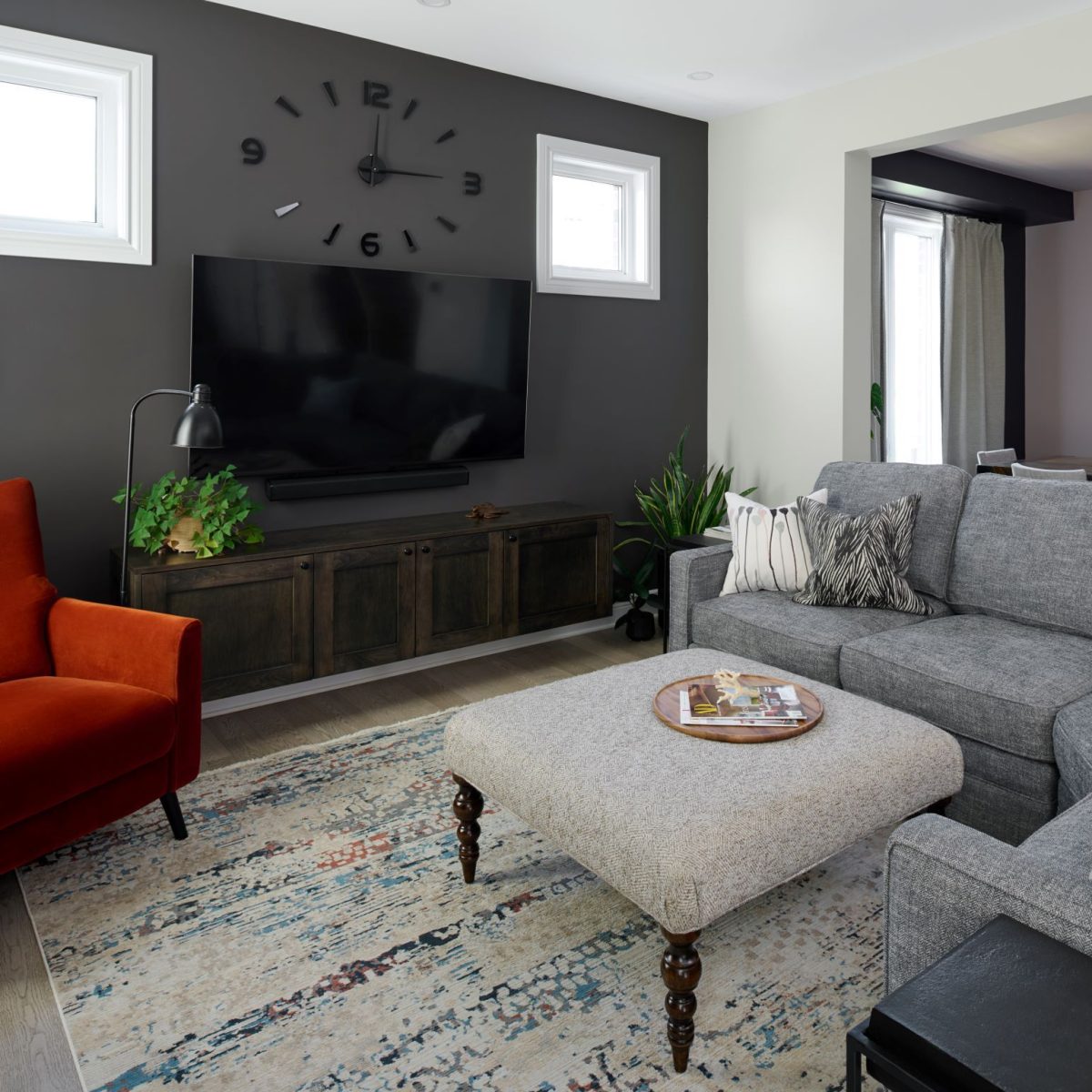
Benjamin Moore consistently delivers hues that strike the perfect balance between sophistication and timelessness. Their 2026 Colour of the Year is Silhouette—an elegant colour that weaves rich espresso hues with refined notes of charcoal.

How to use it: Pair Benjamin Moore’s 2026 colour with warm neutrals, and tactile materials like wool, linen, and natural wood for a look that feels both contemporary and enduring. Treat it like a neutral with character that will look fabulous with various pops of colour.

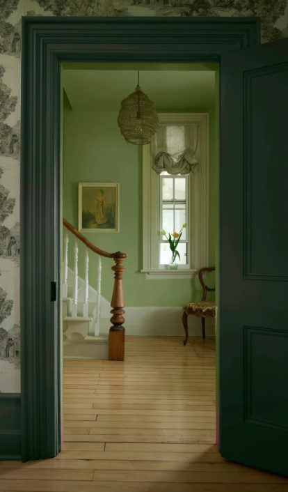
BeautiTone – Muse (TR26-4-3) 🍁
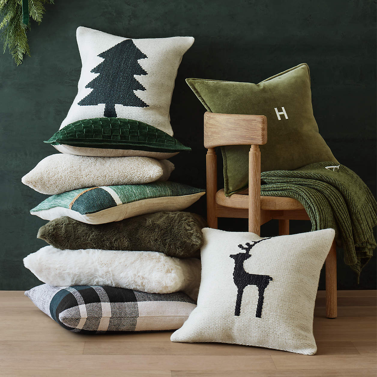
Canadian brand BeautiTone chose Muse, a deep, moody green, steeped in the artistry of the classic painters, providing darkness with earthy depth, a place where mystery and light converge. This shade anchors spaces with introspective elegance, a tone that grounds and deepens the world around it.
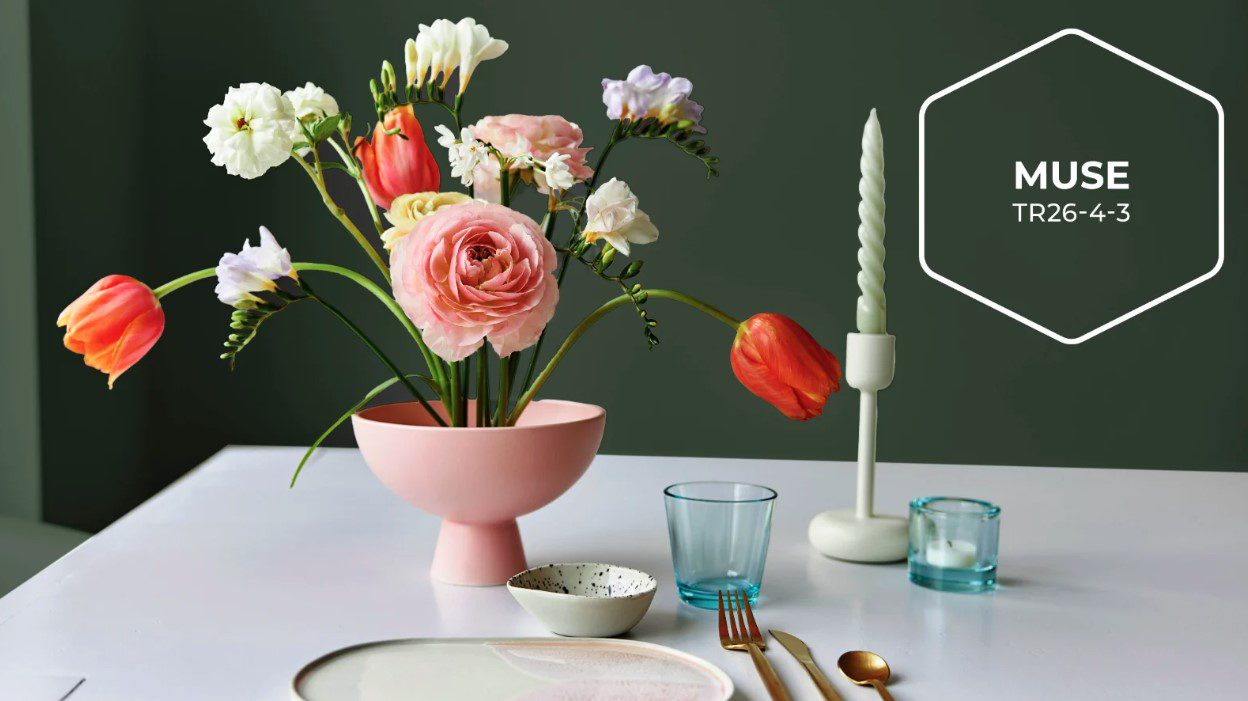
How to use it: Try Muse in an entryway, bedroom or home office for a sophisticated statement. Pair it with soft ivory, caramel tones, and brushed gold accents for a refined, inviting effect.

Cloverdale Paint🍁
(Announcement expected soon)
Cloverdale Paint, another Canadian favourite, often draws inspiration from nature’s palette—expecting a hue that bridges indoor comfort and outdoor serenity.
Sherwin-Williams – Universal Khaki (SW 6150)
Sherwin-Williams embraces timeless versatility with Universal Khaki, a warm, grounded neutral that works beautifully across styles. It’s soft enough to feel calming yet has enough depth to anchor a room with quiet strength.

How to use it: Perfect for open-concept homes, this shade pairs effortlessly with creamy whites, charcoal, or muted greens. Add texture through woven rugs or rustic wood to bring warmth and character.


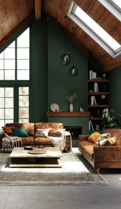
Behr – Hidden Gem (N430-6A)
Behr’s Hidden Gem is a smoky jade that feels both refreshing and sophisticated. This mid-tone green invites a sense of nature and tranquility while maintaining a refined modern edge.
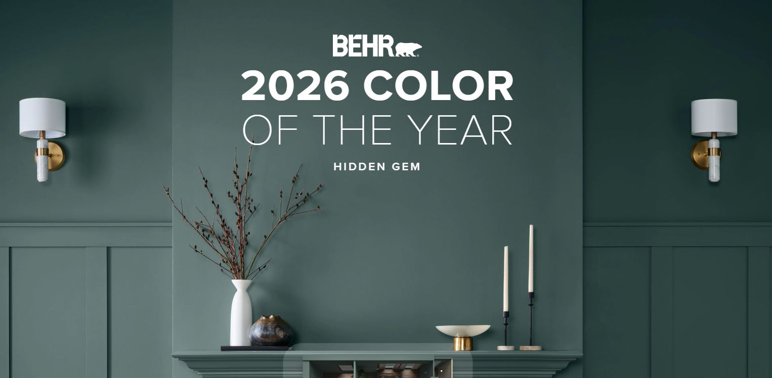
How to use it: This is a universal moody tone that can be used in any space. Pair Hidden Gem with soft whites, brass fixtures, and natural stone for a crisp, balanced look.

Valspar – Warm Eucalyptus (8004-28F)
Warm Eucalyptus by Valspar captures the soothing essence of greenery with a warm, muted undertone. It’s an effortlessly liveable colour that bridges calmness and rejuvenation, making it perfect for everyday spaces.
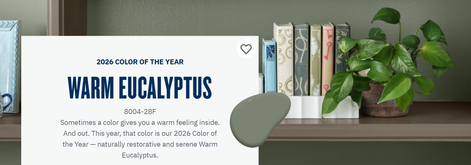
How to use it: Combine this hue with off-whites and soft terracotta for a cozy, organic palette. It also shines in minimalist or Scandinavian-inspired settings.


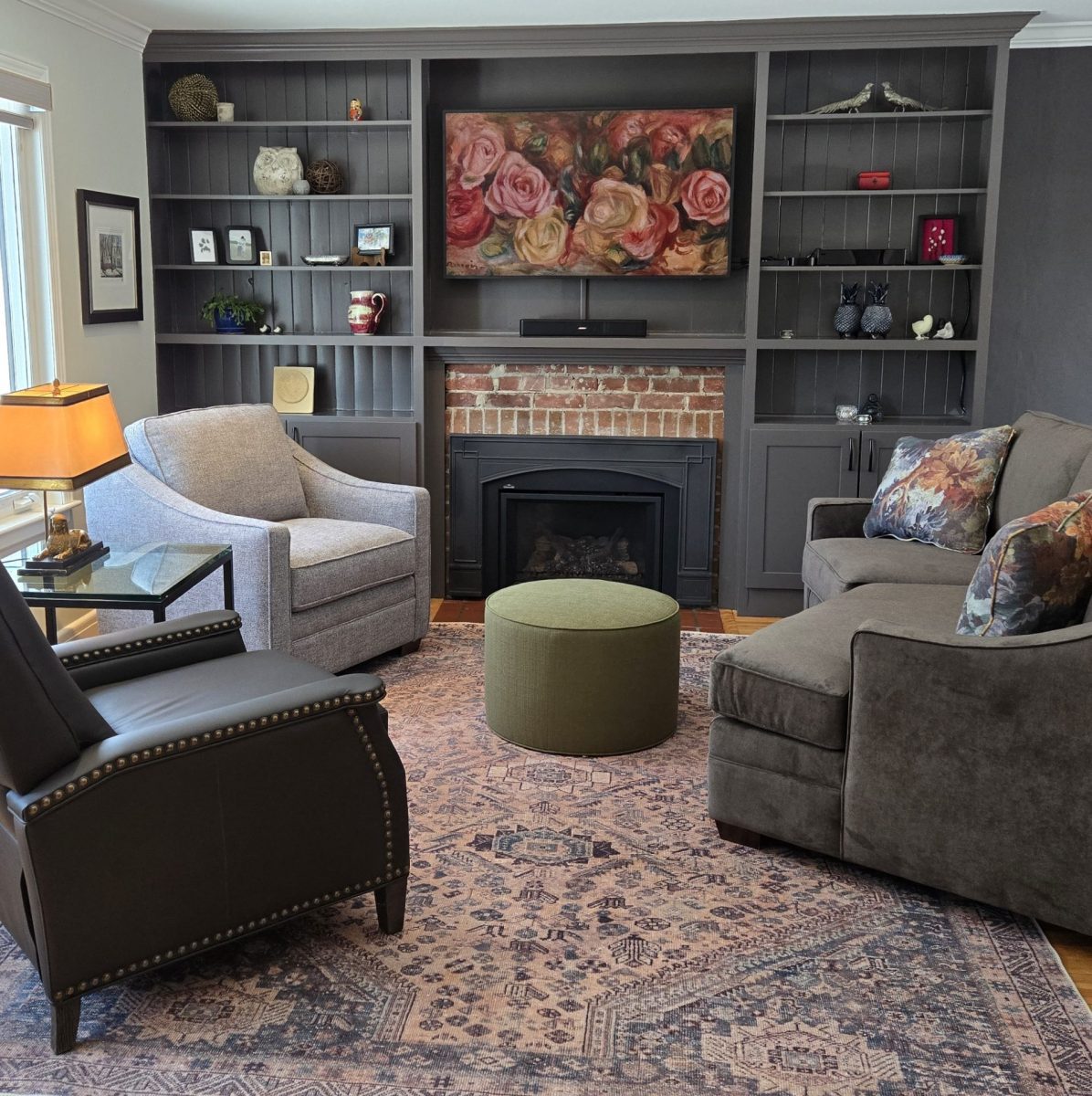
Dulux – Pine Forest (DLX1134-7) 🍁
Dulux Canada’s Pine Forest is a deep, rich green that brings the beauty of our northern landscapes indoors. It evokes a sense of grounded tranquility and pairs beautifully with natural materials and warm lighting.
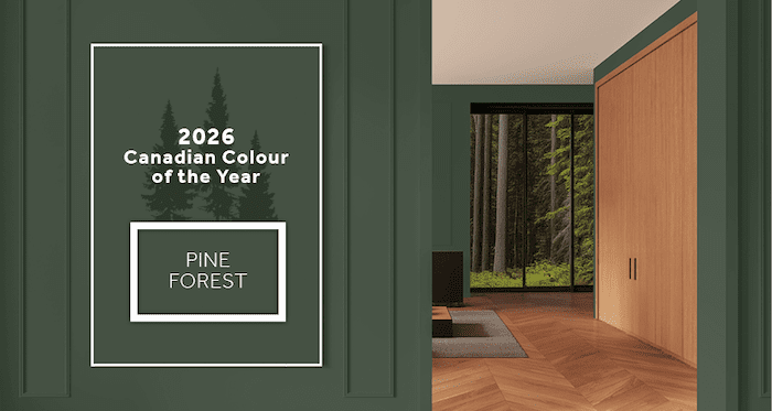
How to use it: Use Pine Forest on cabinetry or accent walls to create depth and sophistication. Balance it with light wood, stone, and creamy neutrals for a luxurious, modern feel.

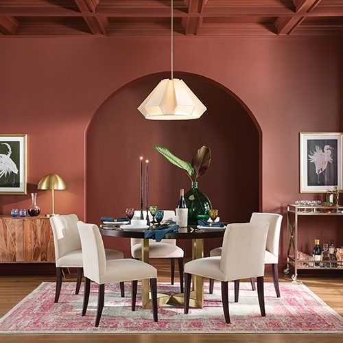
Glidden – Warm Mahogany (PPG1060-7)
Glidden’s Warm Mahogany adds a bold yet comforting touch with its rich brown-red tones. It’s a colour that exudes confidence while maintaining a sense of timeless warmth—perfect for spaces where you want to feel embraced.
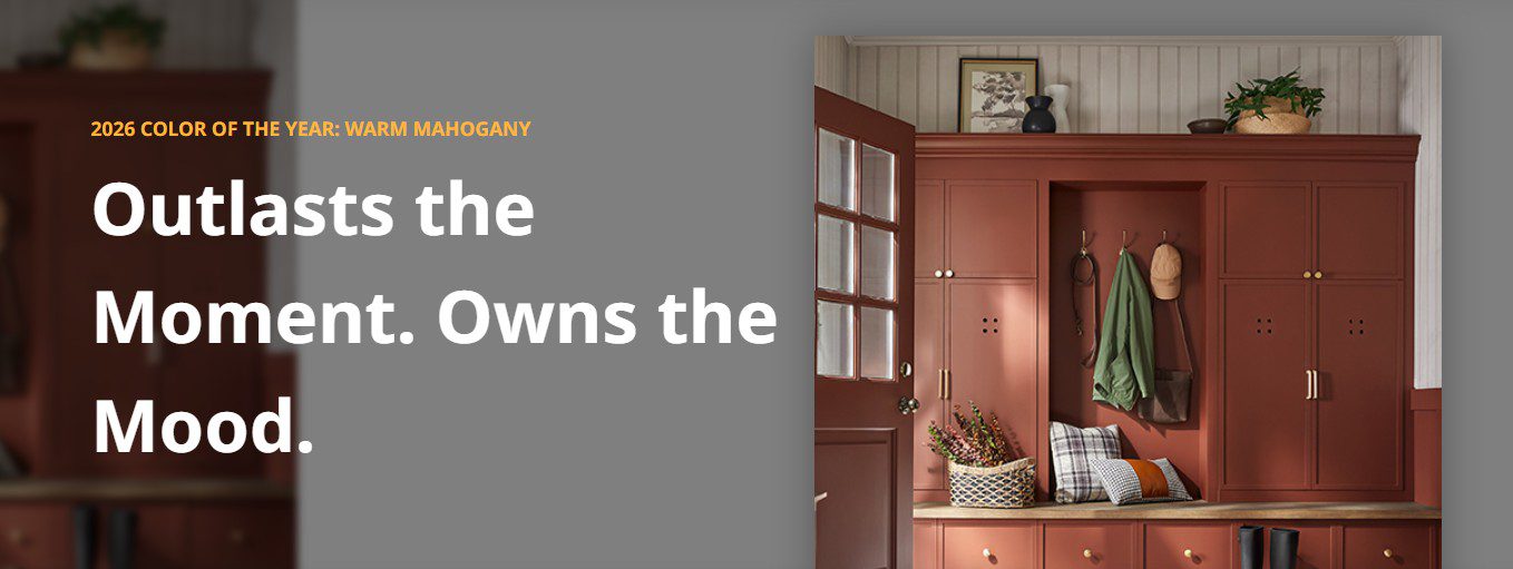
How to use it: Pair it with soft beiges or muted greens for a harmonious effect, or go dramatic with dark trim and vintage brass accents.


Looking Ahead
From grounding neutrals and rejuvenating greens to creative teals and rich mahogany, 2026 is shaping up to be a year of thoughtful expression through colour. Each hue tells a story of balance between energy and calm, tradition and innovation, comfort and curiosity.
As Pantone prepares to announce its influential pick, one thing is clear: colour continues to shape how we live, feel, and connect with our spaces.
At Marina Pavlova Design, we help homeowners interpret these trends through a timeless lens curating interiors that feel authentically yours while staying attuned to what’s fresh and inspiring.
Let's Stay Connected!
Subscribe to my newsletter for exclusive design insights, curated inspiration, and first dibs on upcoming events. You’ll also get a peek behind the scenes — because beautiful, elevated spaces don’t just magically happen, even if it sometimes looks that way.
Stay connected, stay inspired — and bring fresh ideas home.