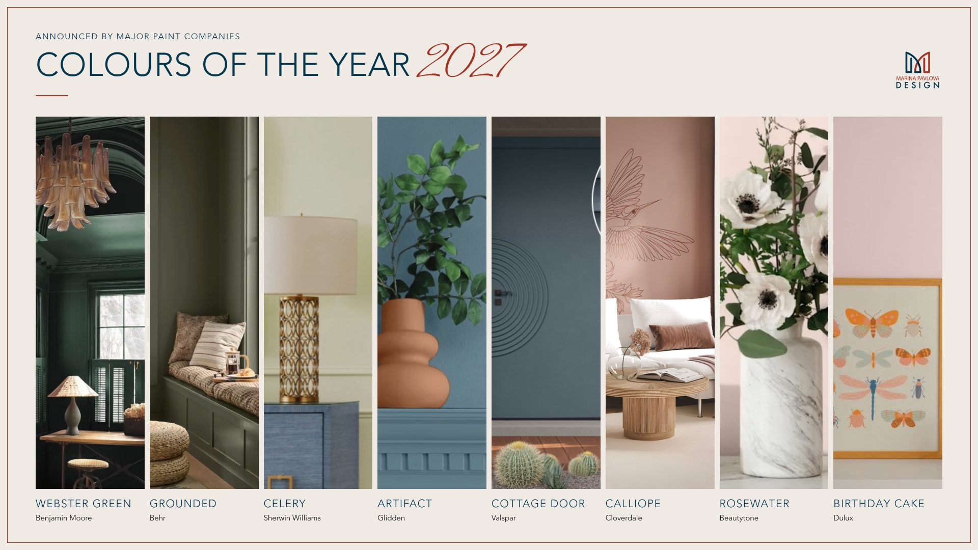
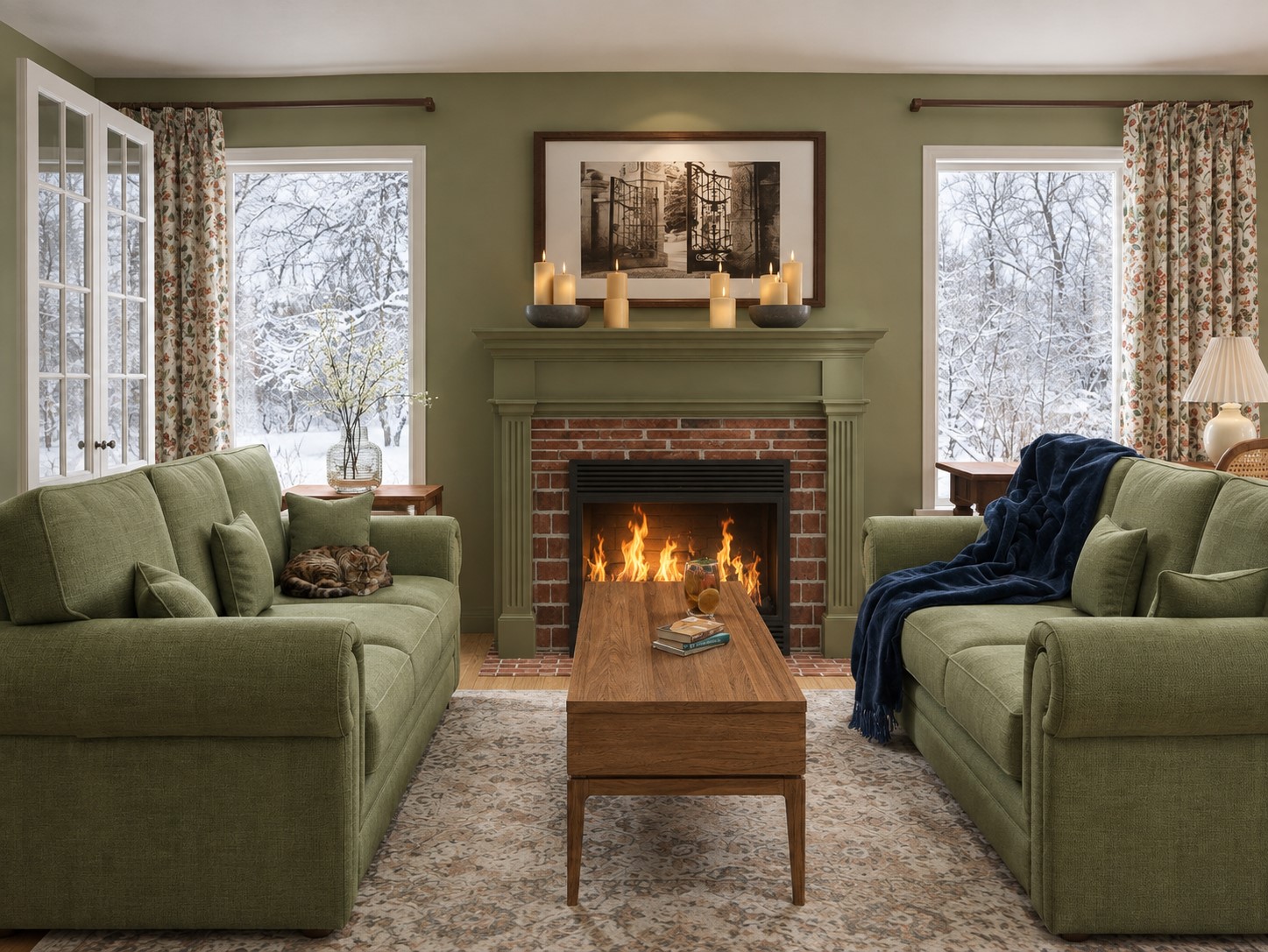
Colour of the year season is complete, and 2027 arrives with real variety. Benjamin Moore chose Webster Green, a classic mid-tone green. Sherwin-Williams named Celery, a soft herbal green, and Behr chose Grounded, a mossy olive. In Canada, Beauti-Tone’s Rosewater, Cloverdale’s Calliope and Dulux’s Birthday Cake bring three different pinks. Valspar’s Cottage Door and Glidden’s Artifact add two blues.
Greens, pinks and blues sit side by side, with room for all of them. That reflects something true about good design. The best homes are a mix, and the mix is chosen.
The mix is a decision
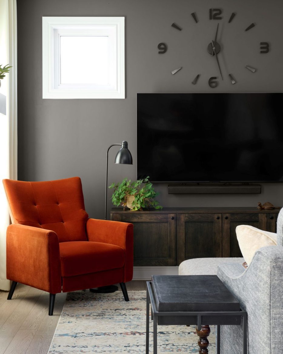
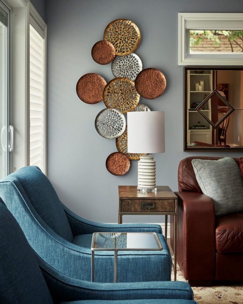
An eclectic home is not an accident of time. It is a choice, made deliberately, often within a single project. A vintage find sits beside a custom piece. An inherited object sits beside something new. A designer makes these decisions on purpose, often on day one.
Eclectic means curated to feel collected, even when every piece was chosen with intention in one scheme.
Why the mix feels authentic
A home styled from a single catalogue or mood board reads as staged, however new it is. A room that blends sources and periods feels lived in, because that is how people gather a life, compressed here into one deliberate plan.
Structure makes it work. Proportions agree. A colour story holds the room together. And every mixed room has one focal point, a light fixture, a fireplace, a single striking object, that gives the eye somewhere to land first. With a focal point, a mix reads as curated.
What this year’s colours are saying
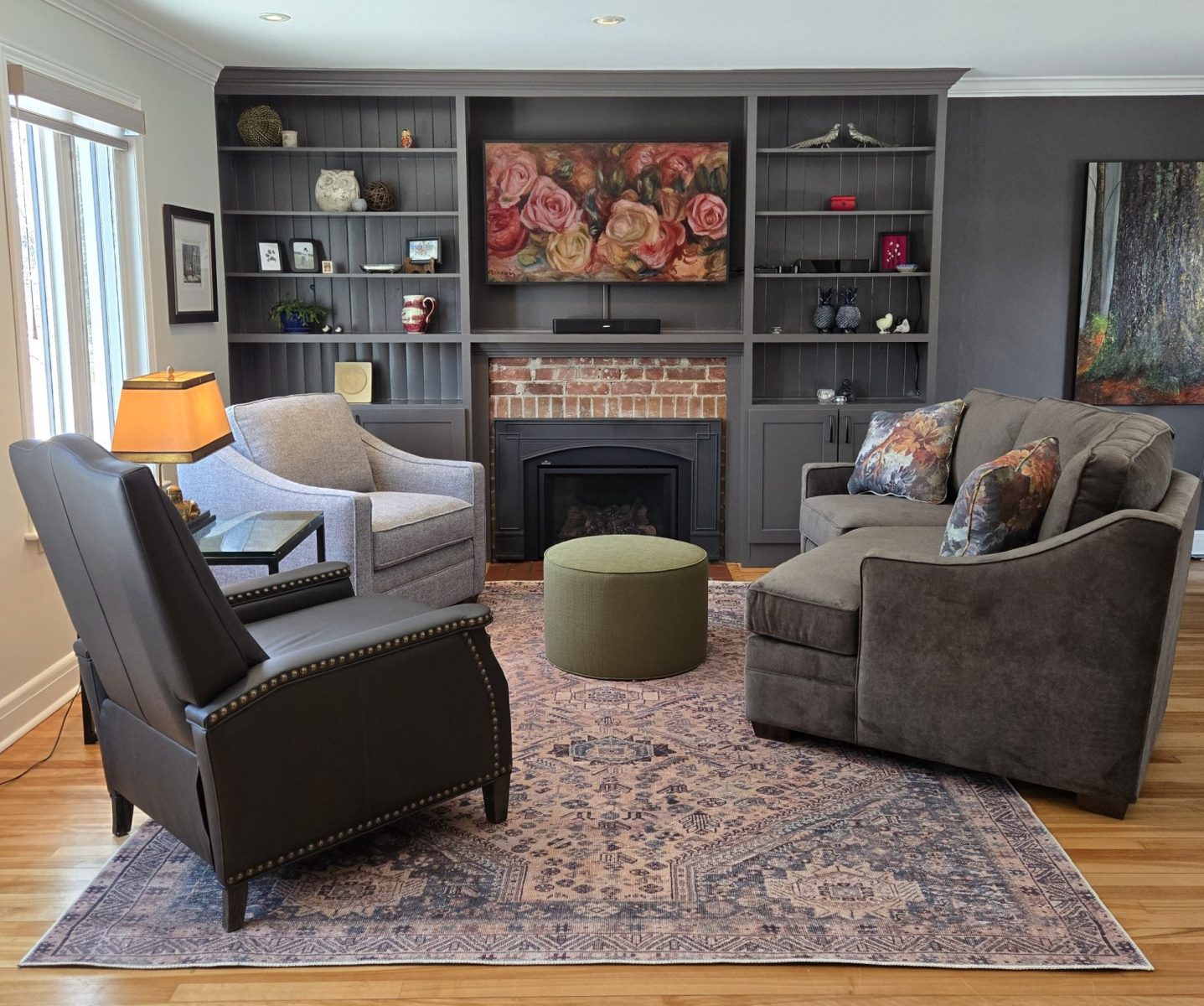
Benjamin Moore describes Webster Green as adaptable, able to layer into any aesthetic, and pairs it with dusky pastels and tawny browns in its 2027 palette. Sherwin-Williams positions Celery around balance. Glidden presents Artifact as a blue that leaves the story of the room to the homeowner.
Across eight brands, the message is consistent: choose the colour that suits you. That is permission to build a palette from instinct, and to let a room hold more than one era and more than one source, guided by someone making those choices with intention.
The takeaway
Every Fall, the industry names the colours of the year ahead. This year the answer is a range, from deep green to soft pink to smoky blue. The most compelling homes follow the same principle. They feel collected, old and new together, pulled into place by a deliberate hand.
That is authenticity, designed on purpose.
If you would like to revisit the colours of 2026 read “Colours of 2026“.
Let's Stay Connected!
Subscribe to my newsletter for exclusive design insights, curated inspiration, and first dibs on upcoming events. You’ll also get a peek behind the scenes — because beautiful, elevated spaces don’t just magically happen, even if it sometimes looks that way.
Stay connected, stay inspired — and bring fresh ideas home.